


Graphic Design Systems
A practical collection of printed and downloadable design references created to support students, educators and professional designers.
Reference Series is an expanding collection of printed reference cards and downloadable resources exploring the principles, systems and processes that underpin graphic design. Designed as practical working references rather than textbooks, each series focuses on a specific subject through concise explanations, visual examples and downloadable assets that can be used in practice.
Explore the complete Reference Series
Explore the complete Reference Series

Why I Created It
During more than twenty-five years as a designer, lecturer and workshop tutor, I found myself repeatedly sketching the same diagrams, explaining the same principles and recommending the same books.
Reference Series grew from the idea that these foundations deserved to exist as designed tools that could live on a desk rather than disappear into notebooks.
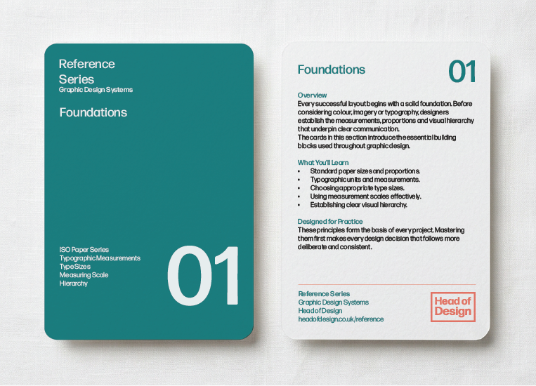
Foundations
"Good design is as little design as possible."
Dieter Rams
Dieter Rams
Foundations introduces the fundamental principles that underpin effective graphic design. Before exploring grids, typography or composition, it is essential to understand the measurements, proportions and visual hierarchy that allow designers to communicate with clarity and purpose.
These references provide practical tools rather than theory alone, helping establish the knowledge that supports every design decision. Mastering these fundamentals makes more advanced systems easier to understand and apply with confidence.
Whether you're beginning your design journey or revisiting core principles, these cards are intended as working references that can remain within easy reach throughout the design process.

The ISO 216 paper system provides the international standard for paper sizes used throughout graphic design, publishing and print. Every format shares the same aspect ratio, allowing artwork to scale seamlessly between sizes without altering its proportions.
Understanding this relationship makes planning layouts, preparing artwork and communicating print specifications significantly easier.
Included Resources
• Adobe Illustrator (.AI)
• Adobe InDesign (.INDD)
• Print-ready PDF

Typography is built upon systems of measurement that have evolved over centuries. Points, picas, Didot and Cicero all provide precise ways of defining the size and spacing of type, ensuring consistency across both print and digital design.
Although modern software performs these calculations automatically, understanding the underlying units allows designers to communicate more accurately, reproduce layouts faithfully and appreciate the historical foundations of typography.

Selecting appropriate type sizes is one of the simplest ways to improve readability and establish visual hierarchy. Small adjustments can significantly influence how information is perceived, guiding readers naturally through a page while maintaining comfort and clarity.
Rather than relying on arbitrary values, experienced designers choose type sizes as part of a coherent system that balances content, hierarchy and the intended reading distance.

Every design project depends upon accurate measurement. Whether specifying margins, positioning elements or preparing artwork for production, consistent measurement ensures precision throughout the design process.
Understanding the relationship between millimetres, points, picas and pixels allows designers to move confidently between different software, media and production methods while maintaining consistency across every stage of a project.

Visual hierarchy organises information so readers instinctively know where to look first, what to read next and what can be discovered later. Through careful control of size, weight, spacing, contrast and position, designers create structure without relying on explicit instruction.
Strong hierarchy improves communication, reduces cognitive effort and allows complex information to be understood quickly, making it one of the most fundamental principles of effective graphic design.
Explore the Foundations Bundle
Explore the Foundations Bundle
Foundations - The essential principles that underpin every area of graphic design.
Recommended Reading: The following books have informed generations of designers and continue to shape the way graphic design is taught and practised. Together they provide an excellent foundation for further study and remain among the most valuable references on my own bookshelf.
The Non-Designer's Design Book
Robin Williams
A clear and approachable introduction to alignment, proximity, repetition and contrast.
Robin Williams
A clear and approachable introduction to alignment, proximity, repetition and contrast.
Thinking with Type
Ellen Lupton
One of the best introductions to typography, covering both theory and practical application.
Ellen Lupton
One of the best introductions to typography, covering both theory and practical application.
Graphic Design: The New Basics
Ellen Lupton & Jennifer Cole Phillips
An excellent exploration of visual language, hierarchy and composition through practical exercises.
Ellen Lupton & Jennifer Cole Phillips
An excellent exploration of visual language, hierarchy and composition through practical exercises.
Universal Principles of Design
William Lidwell, Kritina Holden & Jill Butler
A broad reference to the psychological and perceptual principles that underpin effective design.
William Lidwell, Kritina Holden & Jill Butler
A broad reference to the psychological and perceptual principles that underpin effective design.
Many of these titles can be found through university libraries, independent bookshops and specialist second-hand booksellers.

Editorial Grids
"The grid is an aid, not a guarantee."
Josef Müller-Brockmann
Josef Müller-Brockmann
Editorial grids provide the structural framework that organises information across books, magazines, posters and digital interfaces. By dividing a page into consistent modules, designers create systems that improve alignment, hierarchy and visual rhythm while allowing flexibility within a coherent structure.
The references in this section explore a range of grid configurations, demonstrating how increasing complexity offers greater creative freedom without sacrificing consistency. Understanding these systems provides a foundation for producing layouts that are both disciplined and expressive.

8-Field Editorial Grid
The 8-field grid introduces the principle of dividing a page into consistent modules, providing a simple framework for organising content while maintaining flexibility. Although uncomplicated, it demonstrates how even modest grid systems can create order and improve visual relationships.
Small modular grids are particularly useful for posters, simple layouts and introductory editorial work where clarity is more important than complexity.

20-Field Editorial Grid
Expanding the number of modules increases flexibility without sacrificing structure. The 20-field grid provides greater freedom when arranging images, typography and white space while preserving consistent alignment throughout the page.
It represents an ideal balance between simplicity and versatility, making it suitable for a wide range of editorial and communication design projects.

32-Field Editorial Grid
Larger modular grids offer designers remarkable freedom while maintaining rigorous consistency. The 32-field grid supports sophisticated layouts, complex information hierarchies and varied combinations of text and imagery without losing visual cohesion.
Despite its complexity, every decision remains grounded within an underlying system that strengthens the final composition.

Column Systems
Column grids form the backbone of newspapers, magazines, books and websites. By dividing information into vertical structures, designers create rhythm, consistency and flexibility while making content easier to navigate.
Whether using two columns or twelve, understanding column systems enables layouts to adapt across different formats while maintaining a coherent visual language.
Explore the editable grid resources
Explore the editable grid resources
Editorial Grids - Building structure through grids, alignment and modular thinking.
Recommended Reading: These books explore the development and practical use of grid systems, demonstrating how structure can support creativity rather than restrict it. They remain essential references for editorial, branding and information design.
Grid Systems in Graphic Design
Josef Müller-Brockmann
The definitive work on modular grids and one of the most influential books in graphic design.
Josef Müller-Brockmann
The definitive work on modular grids and one of the most influential books in graphic design.
Making and Breaking the Grid
Timothy Samara
A contemporary guide that explains both disciplined grid systems and when it is appropriate to move beyond them.
Timothy Samara
A contemporary guide that explains both disciplined grid systems and when it is appropriate to move beyond them.
Grid Systems
Kimberly Elam
An accessible introduction to a wide variety of grid structures with practical visual examples.
Kimberly Elam
An accessible introduction to a wide variety of grid structures with practical visual examples.
Designing with Grids
Timothy Samara
Explores how grid systems support posters, books, magazines and digital layouts.
Timothy Samara
Explores how grid systems support posters, books, magazines and digital layouts.
Many of these titles can be found through university libraries, independent bookshops and specialist second-hand booksellers.
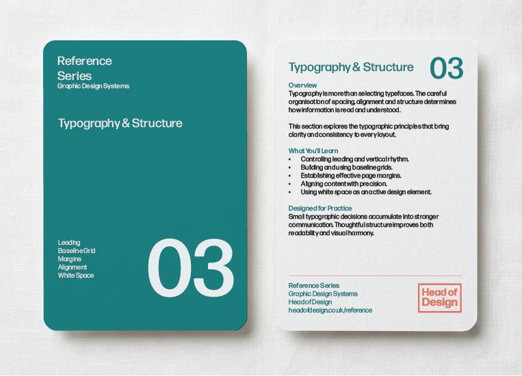
Typography & Structure
"Typography exists to honour content."
Robert Bringhurst
Robert Bringhurst
Typography is shaped as much by structure as by the letterforms themselves. Decisions relating to leading, margins, alignment and white space all contribute to readability, rhythm and the overall experience of a page, often in ways that remain unnoticed by the reader.
These references examine the invisible systems that support effective typography, revealing how careful attention to structure transforms individual elements into coherent and engaging compositions.
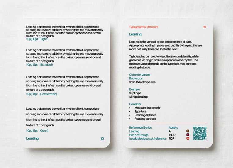
Leading determines the vertical space between lines of text and has a profound influence on readability. Appropriate leading creates rhythm and openness, allowing the eye to move comfortably through longer passages without fatigue.
Small adjustments often produce significant improvements, making leading one of typography's most powerful yet frequently overlooked tools.

A baseline grid aligns text across multiple columns and pages, ensuring every line sits upon a consistent underlying structure. Although often invisible, it creates subtle harmony that contributes to the professionalism of editorial design.
When combined with paragraph styles and modular grids, the baseline grid becomes one of the key systems underpinning sophisticated publications.

Margins define the relationship between content and the page itself. More than simply empty space, they establish balance, improve readability and provide visual breathing room that allows information to be comfortably absorbed.
Throughout history, designers and typographers have developed proportional systems that continue to influence contemporary editorial design, demonstrating that well-considered margins remain fundamental to effective communication.

Alignment creates visual relationships between individual elements, allowing layouts to appear organised and intentional. Consistent alignment reduces visual noise, strengthens hierarchy and enables readers to process information more efficiently.
Whether aligning to a grid, a common edge or an invisible axis, careful alignment brings clarity and confidence to every composition.
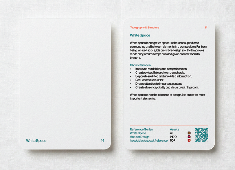
White space is not empty space but an active component of every composition. By providing separation between elements, it improves readability, strengthens hierarchy and gives content room to breathe.
Effective use of white space often distinguishes refined design from cluttered layouts, demonstrating that restraint can communicate as powerfully as complexity.
Explore the Typography & Structure Bundle
Explore the Typography & Structure Bundle
Typography & Structure - The invisible systems that transform typography into communication.
Recommended Reading: These books explore the craft of typography, from choosing and setting type to creating harmonious page structures. They have influenced generations of designers and remain among the most respected references available.
The Elements of Typographic Style
Robert Bringhurst
Widely regarded as one of the finest books ever written on typography.
Robert Bringhurst
Widely regarded as one of the finest books ever written on typography.
Typography
Emil Ruder
A classic exploration of typographic principles from the Swiss tradition.
Emil Ruder
A classic exploration of typographic principles from the Swiss tradition.
The Form of the Book
Jan Tschichold
A thoughtful examination of page construction, margins and the craft of book design.
Jan Tschichold
A thoughtful examination of page construction, margins and the craft of book design.
Detail in Typography
Jost Hochuli
A concise but insightful guide to the finer details that distinguish excellent typography.
Jost Hochuli
A concise but insightful guide to the finer details that distinguish excellent typography.
Many of these titles can be found through university libraries, independent bookshops and specialist second-hand booksellers.

Composition
"The whole is other than the sum of its parts."
Kurt Koffka
Kurt Koffka
Composition is the process of organising visual elements to communicate clearly and effectively. Through relationships of scale, rhythm, balance and proportion, designers guide the viewer's attention while creating work that feels both purposeful and engaging.
The references in this section explore the principles that bring images, typography and structure together, demonstrating how thoughtful composition underpins successful graphic design across every medium.

Graphic design rarely involves typography or imagery in isolation. Successful compositions depend upon the relationship between both, balancing visual impact with clear communication.
Understanding how images and text support one another enables designers to create layouts that are engaging, informative and visually cohesive.
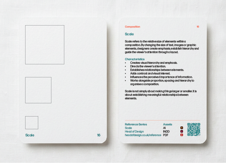
Scale describes the relative size of elements within a composition and influences how information is perceived, prioritised and understood. By varying size intentionally, designers establish emphasis, create contrast and guide the viewer through a visual hierarchy.
Whether comparing typography, imagery or entire layouts, understanding scale allows designers to create compositions that feel balanced, dynamic and appropriate to their intended context.
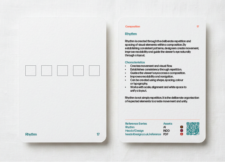
Rhythm introduces movement and pacing within a composition through repetition, variation and consistent spacing. Like music, visual rhythm guides the viewer through information while creating harmony across a layout.
Subtle adjustments to spacing, scale and repetition can dramatically influence the overall experience of a design.

Asymmetrical composition creates balance without relying upon mirrored layouts. By carefully distributing visual weight, designers produce work that feels dynamic, contemporary and engaging while maintaining stability.
Mastering asymmetry encourages more expressive compositions without sacrificing clarity or organisation.

Modular composition combines structured grids with flexible content placement, allowing designers to build complex layouts from consistent underlying units. This approach simplifies decision making while supporting variety across multiple pages or formats.
It is particularly valuable when designing systems that must remain coherent across a wide range of applications.

Grid systems provide the invisible framework that supports much of modern graphic design. Rather than restricting creativity, they establish order that allows designers to make informed decisions about typography, imagery, spacing and hierarchy.
Understanding grids is less about following rigid rules than recognising how thoughtful structure can enhance communication, improve consistency and create more confident design solutions.
Explore the Composition Bundle
Explore the Composition Bundle
Composition - Where structure, typography and imagery become visual communication.
Recommended Reading: These books explore the relationships between form, balance, rhythm and perception, helping designers understand how visual elements work together to create meaningful compositions.
Principles of Form and Design
Wucius Wong
A comprehensive guide to visual organisation and compositional thinking.
Wucius Wong
A comprehensive guide to visual organisation and compositional thinking.
Geometry of Design
Kimberly Elam
Explores proportion, geometry and classical compositional systems in design.
Kimberly Elam
Explores proportion, geometry and classical compositional systems in design.
Art and Visual Perception
Rudolf Arnheim
A seminal work on visual psychology and how we perceive composition.
Rudolf Arnheim
A seminal work on visual psychology and how we perceive composition.
Visual Grammar
Christian Leborg
An accessible introduction to the fundamental elements and principles of visual communication.
Christian Leborg
An accessible introduction to the fundamental elements and principles of visual communication.
Many of these titles can be found through university libraries, independent bookshops and specialist second-hand booksellers.
Continue Exploring - The Reference Series is intended as a practical introduction rather than a comprehensive textbook. The books above and in previous sections provide an excellent starting point for anyone wishing to explore these principles in greater depth.